
 by
by Cottagecore kitchen ideas for whimsical storybook charm work without renovating, and the best ones usually cost less than a single new cabinet front. I learned that after spending money on the wrong thing first: paint samples, then hardware, then one sad light fixture that fixed nothing. The shift came when I started dressing the room the way you dress a bed, in layers. If your kitchen feels flat, you're probably missing softness, patina, and one grounded focal move.
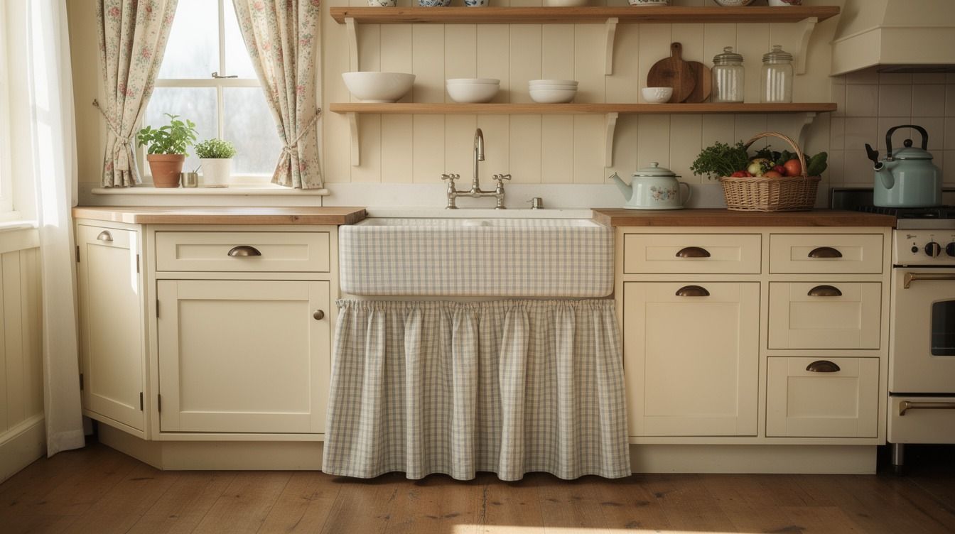
- Skirt the sink with faded ticking fabric
- Hang copper pans on a peg rail
- Line open shelves with scalloped lace trim
- Why mushroom cream beats bright white on lowers
- Cluster floral plates above the breakfast nook
- Tuck herb pots along the sunny sill
- Swap upper doors for gathered gingham curtains
- Layer butcher block counters with crockery stations
- Mount a plate rack over the range
- Style a Welsh dresser moment with transferware
- Add beadboard behind every open shelf
- Mix unlacquered brass with painted wooden knobs
- Frame the window with café curtains
- Display cutting boards beside a stoneware pitcher
- A faded runner against glossy tile
1Skirt the sink with faded ticking fabric
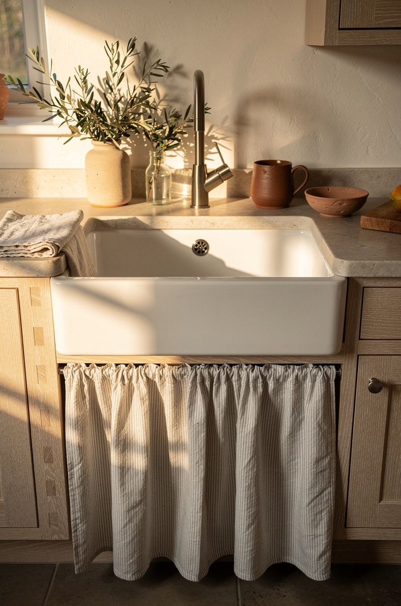
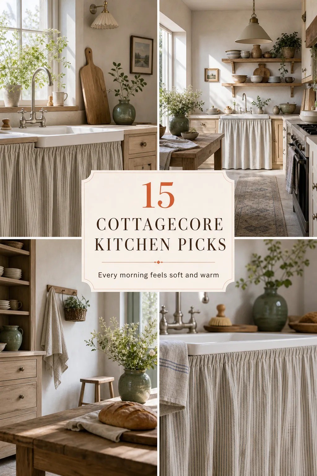
Start under the sink, because that's where a small cottagecore kitchen changes fastest. A faded ticking stripe linen skirt softens the hard box of lower cabinetry and turns plumbing into background texture.
I like it best when you keep the stripe narrow and washed out, the kind that looks a little timeworn rather than crisp. If your base cabinets are cerused white oak, the faded blue or flax stripe feels settled right away.
Use a tension rod inside the opening so you don't commit to anything permanent, especially if you're in a rental. Standard counters sit at 36 in, so let the hem kiss the floor by about half an inch and you'll get that old-house drag without a dust mop situation.
A cotton ticking weave holds up to splashes way better than linen here. I made mine too short once, and the whole thing looked stingy.
The drape and the soft ticking texture quiet the whole kitchen in a way glossy tile never does. It changes the room fast! If you're still deciding whether your room wants pale wood or painted fronts, this guide on white vs wood kitchen cabinets helps you read the room before you buy fabric.
2Hang copper pans on a peg rail
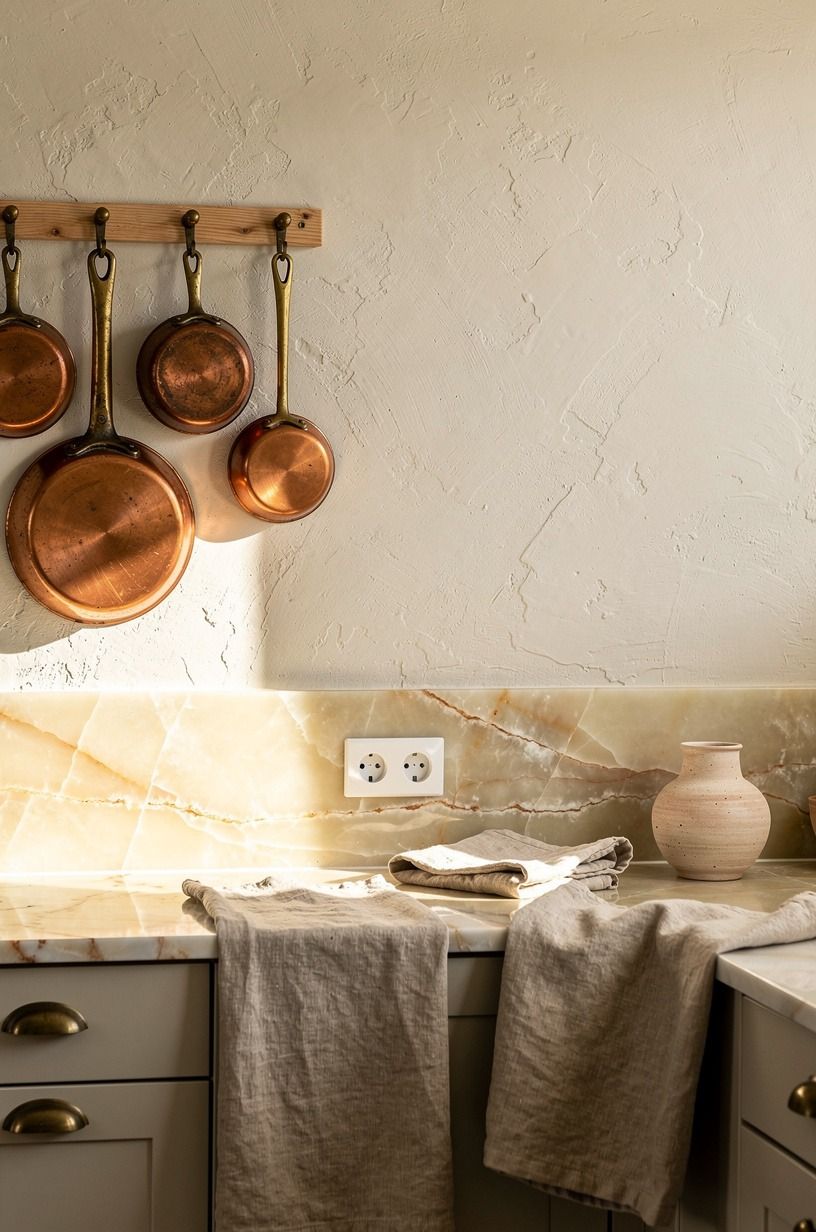
Hang your prettiest pans where you can see them the second you walk in. A simple oak peg rail with warm Mauviel copper sauté pans gives you gleam, storage, and that country core kitchen feeling in one line across the wall. The glow matters more than the quantity.
Four or five pieces with breathing room beat a whole wall packed tight every time.
And you don't need a full wall of metal for it to work.
Place the rail at about 72 in above the floor so the handles clear your backsplash zone, which is usually about 18 in between counter and uppers. And don't buy bright orange copper if you want the room to feel old; aged pieces with a little dullness sit better against plaster and cream paint. You can even echo the warmth with one link to under cabinet lighting ideas to brighten your kitchen because the metal only sings when the evening light hits it from the side.
3Line open shelves with scalloped lace trim
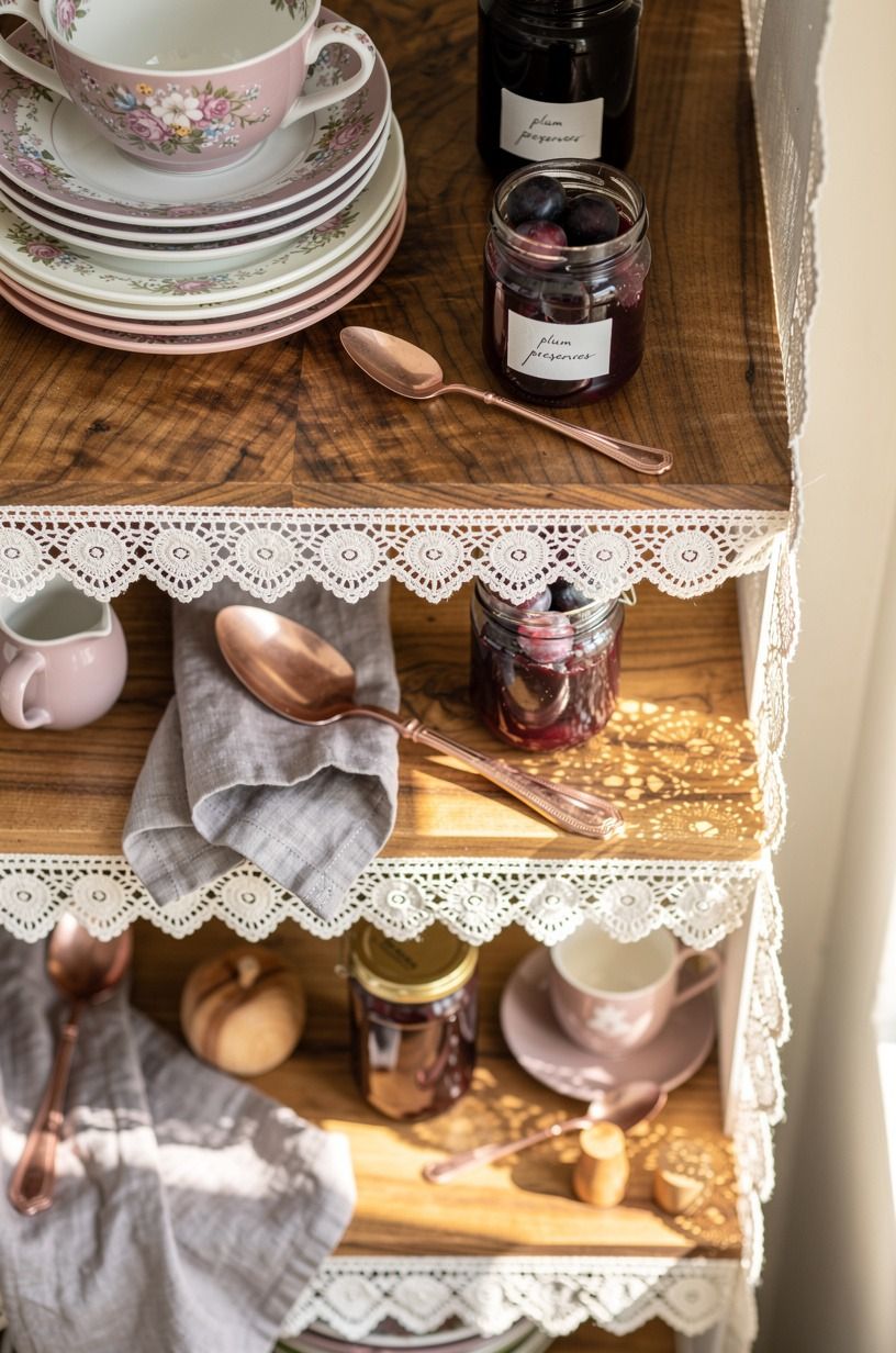
Open shelves can look bare in a hurry, especially in a modern cottage core interior that still has fairly plain cabinet boxes. A run of cotton lace trim along the shelf edge makes stacked floral crockery feel intentional instead of exposed.
I wouldn't use bright white lace here. The better move is tea-stained ivory, something that reads collected, not costume.
A small ironstone pitcher tucked at the end of the shelf quietly carries the room.
Keep the trim narrow, then let the objects do the talking. Plum preserves, a stack of transferware plates, one stoneware sugar jar, and enough empty wood showing between them so your eye can rest. But here's the part people miss: the lace needs contrast behind it.
If your wall color is Benjamin Moore White Dove OC-17, the trim reads soft and gentle rather than fussy, and it plays especially well with the cabinet palette in the most popular kitchen cabinet colors right now.
4Why mushroom cream beats bright white on lowers
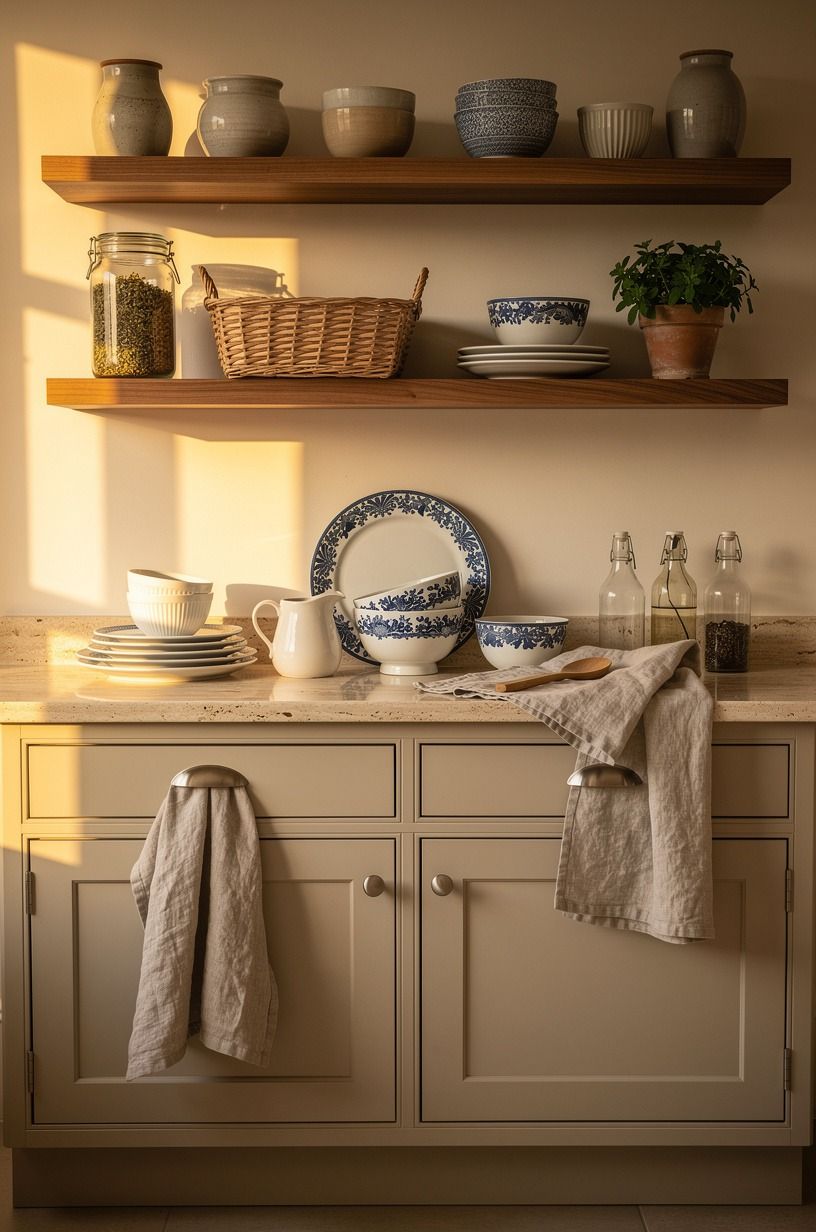
Paint the lowers before you touch the uppers if you want storybook charm without making the room feel themed.
5Cluster floral plates above the breakfast nook
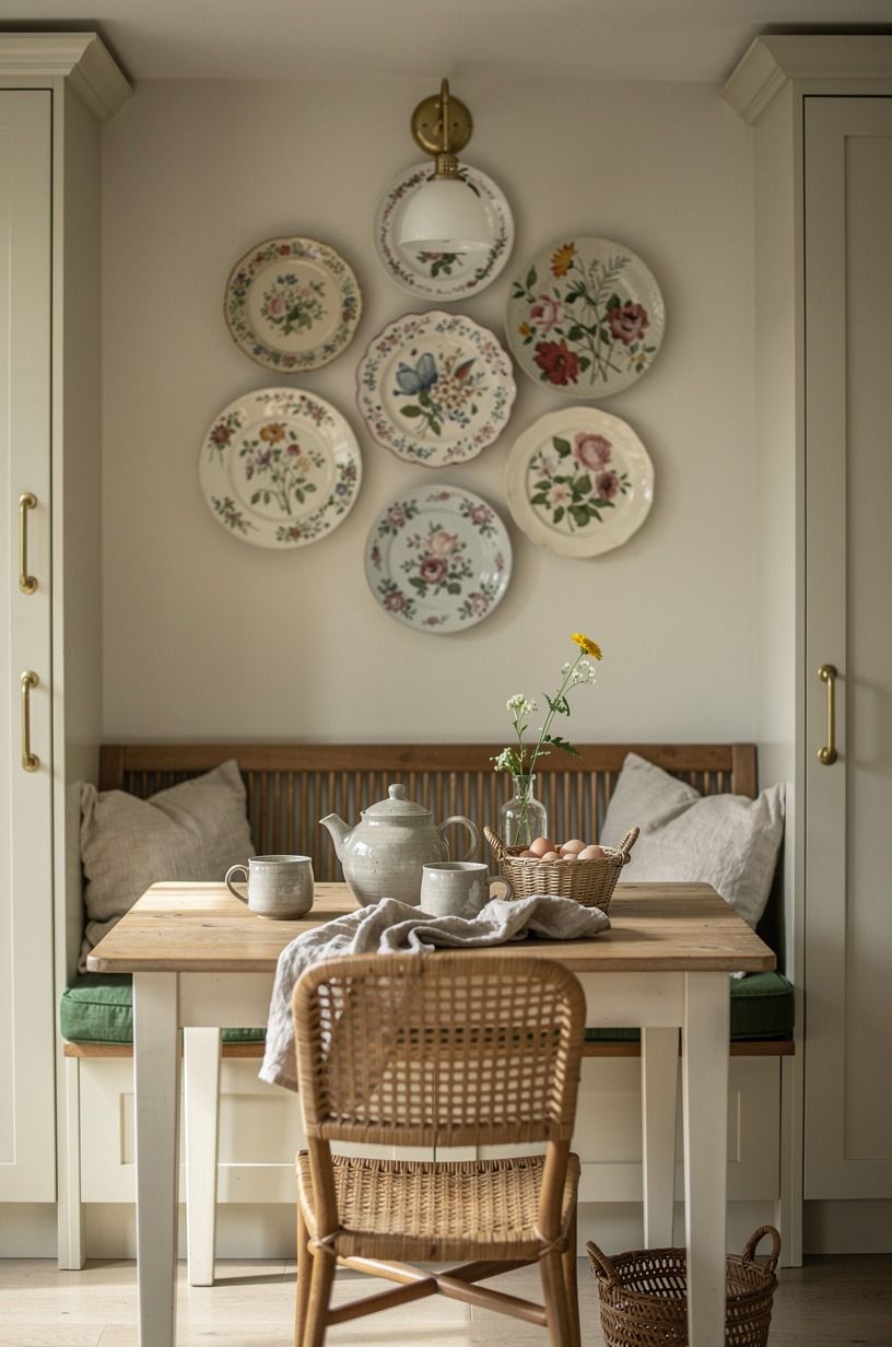
Give the breakfast nook one collected focal point, and let it sit a little high so the bench still feels airy. A tight cluster of floral dessert plates above a painted breakfast nook bench does that better than framed prints because the shine, pattern, and shape already belong in a kitchen.
I prefer mismatched edges and repeated color families over a matched boxed set. Too even, and the charm disappears.
Hang the grouping as one visual cloud rather than a perfect grid. I usually start with the largest plate a few inches above head height when you're seated, then build out from there with smaller blooms in dusty rose, moss, and soft butter yellow.
Why does that matter? Because you want your eye to travel upward without making the nook feel crowded, and a single ironstone bowl on the bench grounds the whole scene. If your bench area is small, borrow spacing ideas from small outdoor kitchen ideas that maximize every inch and apply that same restraint indoors.
6Tuck herb pots along the sunny sill
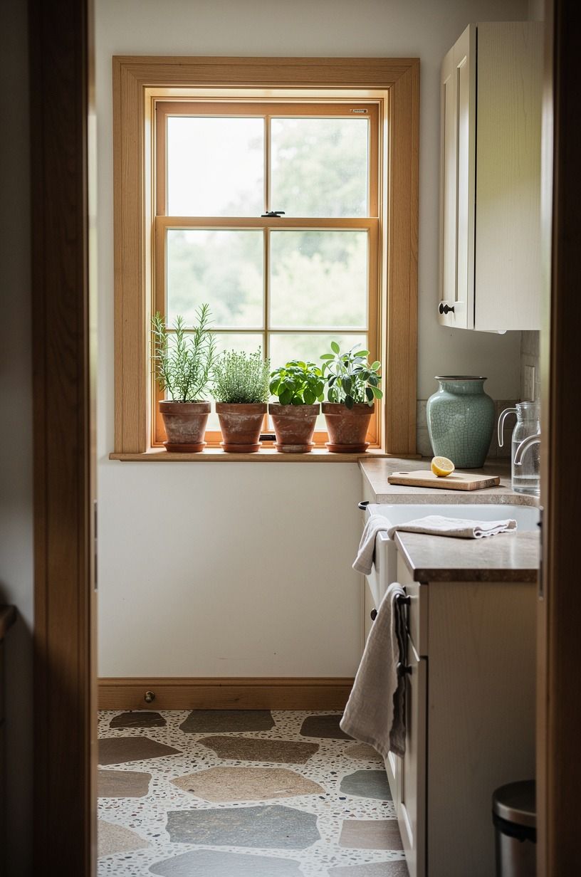
Tuck herbs where the window already wants to be generous. A line of terracotta herb pots on a wide painted sill, with rosemary, thyme, and basil in slightly uneven heights, adds life you can't fake with a bowl of decorative moss. I love this one because it's useful and pretty at the same time.
And yes, the smell when the sun hits rosemary is half the reason to do it.
Keep the containers small enough that you don't crowd the glass or choke the light. In a small cottagecore kitchen, three to five pots are usually enough, especially if the foliage is dark and full against white trim. That settled, earthy feeling is what no fake moss bowl ever manages.
But skip shiny planters. Terracotta, chipped cream, or a dull green glaze suits the mood far better; one small stoneware saucer under each pot keeps your sill clean.
The scent is ridiculous in July! If your kitchen already has deep cabinet color, the most popular kitchen cabinet colors right now can help you decide whether the herbs should read earthy or lush.
7Swap upper doors for gathered gingham curtains
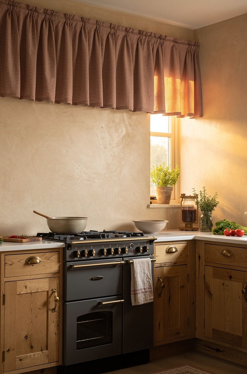
Swap rigid cabinet doors for fabric when the room feels too straight-edged. Gathered gingham café fabric on a slim brass rod across the upper openings softens the run of storage and gives you that cottagecore houses interior feeling without buying new boxes. I like a smaller check here, usually soft red, faded sage, or washed blue, because a giant pattern can start shouting from across the room.
Use this on one cabinet bank, not every upper in sight. The best version keeps a little structure in the room, then lets one corner relax into a softer, lived-in moment. If your uppers are 30 to 42 in tall, mount the rod close to the inside top so the curtain puddles slightly into the opening instead of hanging stiff and flat.
But keep the fabric soft, not sugary. Red-and-cream gingham reads more honest than the synthetic bright checks at the big box store.
And if you're deciding between painted curtains and visible wood around them, white vs wood kitchen cabinets how to decide gives you a clean way to choose before you sew.
8Layer butcher block counters with crockery stations
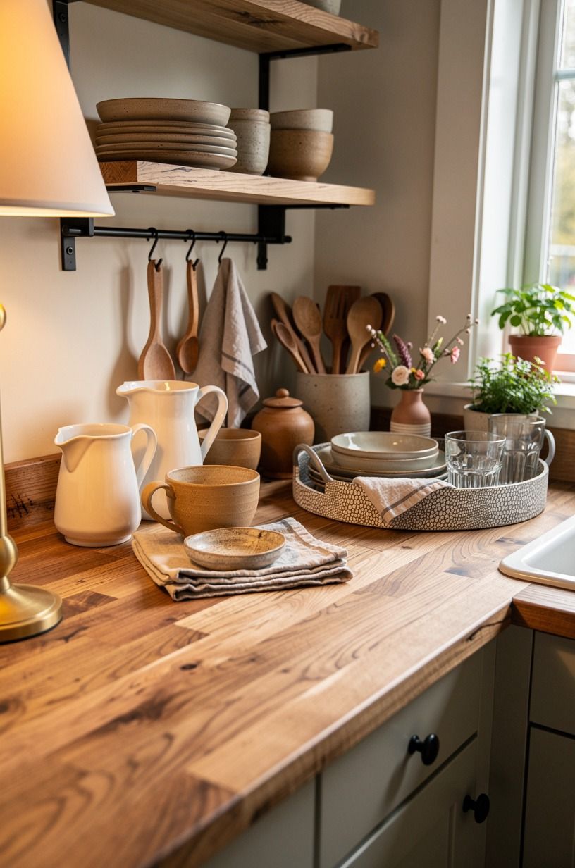
Layer your countertop like a working still life. On butcher block counters, a little crockery station with stacked bowls, a pitcher, and a spoon crock makes the room feel used in the best way.
I don't mean clutter. I mean zones that tell you what belongs there the second you see them.
Try the Three-Object Landing Rule here: one vertical piece, one stack, one open vessel. A stoneware pitcher, three floral bowls, and a crock of wooden spoons is enough to warm an empty stretch of wood without blocking prep space.
Stoneware beats porcelain here because it absorbs light instead of bouncing it back at you. If your counters are laminate for now, that's fine.
The softer staging helps cheap surfaces read more lived-in while you save, and the price ranges in the best outdoor kitchen countertops ranked compared are surprisingly useful for judging what materials feel worth the jump later.
9Mount a plate rack over the range
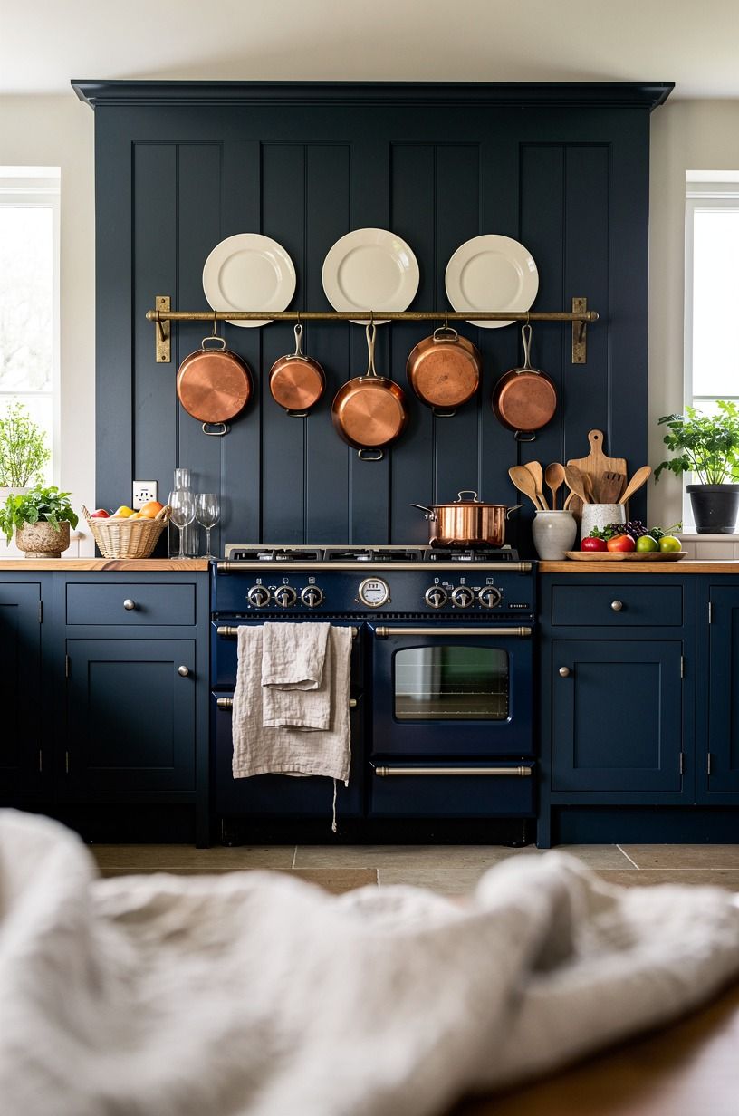
Mount a plate rack over the range wall if that area feels blank and bossy. A simple painted plate rack turns the space above the stove into display, but it also breaks up the hard appliance line that can make a cottagecore kitchen feel more builder basic than storybook. Midnight blue below and warm white plates above is a combination I trust every time.
Keep the plates simple enough that steam and cooking grease won't make you baby them. I'd rather see eight cream plates with a faint blue rim than an overworked collector pattern you never want to wash.
The cream holds the warm glow of the range light without going clinical. The rack itself wants to feel rooted, too.
On a darker wall, Farrow & Ball Studio Green No.93 behind the rack gives the whites real lift, and a slim oak peg beneath stops the whole vignette feeling weightless. and if you're adding side glow nearby, this roundup of under cabinet lighting ideas to brighten your kitchen can stop the stove wall from going dim.
10Style a Welsh dresser moment with transferware
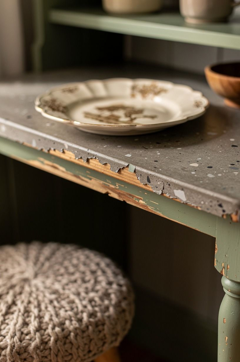
Let one freestanding piece carry some age for the whole room.
11Add beadboard behind every open shelf
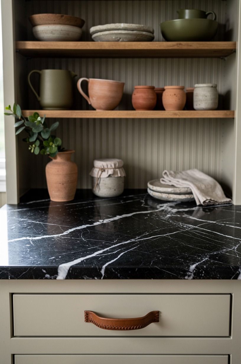
Add a backing panel before you buy more accessories. Beadboard paneling behind open shelving gives crockery, jars, and baskets a visual stop, and it makes even ordinary objects feel framed.
This is one of those moves that looks decorative but fixes a real problem. Shelves floating on plain drywall can feel unfinished fast.
Paint the beadboard the same color as the wall if you want it calm, or shift one step lighter if you want the shelves to stand out. I like the quiet version best, especially over a dark worktop like Nero Marquina marble where you already have enough contrast at counter height.
That grounded contrast is what gives the shelf its glowy, lived-in feeling. But don't run the grooves too wide. Traditional narrow beadboard keeps the scale right for a kitchen; wider panels start reading like a basement.
If your room needs help with wall color first, the most popular kitchen cabinet colors right now is a good temperature check.
12Mix unlacquered brass with painted wooden knobs
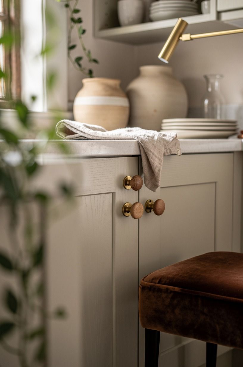
Mix finishes on purpose so the room feels collected over time. Unlacquered brass pulls on drawers with painted wooden knobs on doors gives you shine where your hand lands most and softness where your eye pauses.
I love this because it looks inherited instead of bought in one click. That little bit of mismatch is where the charm lives.
The Two-Hardware Story works best when the shapes are simple. Cup pulls, mushroom knobs, nothing too sleek.
And let the brass age. Fresh lacquered yellow metal is too sharp for this mood, while unlacquered pieces develop the kind of soft patina that makes cream paint look richer. Pair them with a cerused oak pull on the busiest drawer and you'll feel the difference in your hand.
If you're pairing this with painted lowers and wood uppers, white vs wood kitchen cabinets how to decide can help you keep the mix from drifting into random. A single cerused oak pull is the easiest commitment-free test you can make.
13Frame the window with café curtains
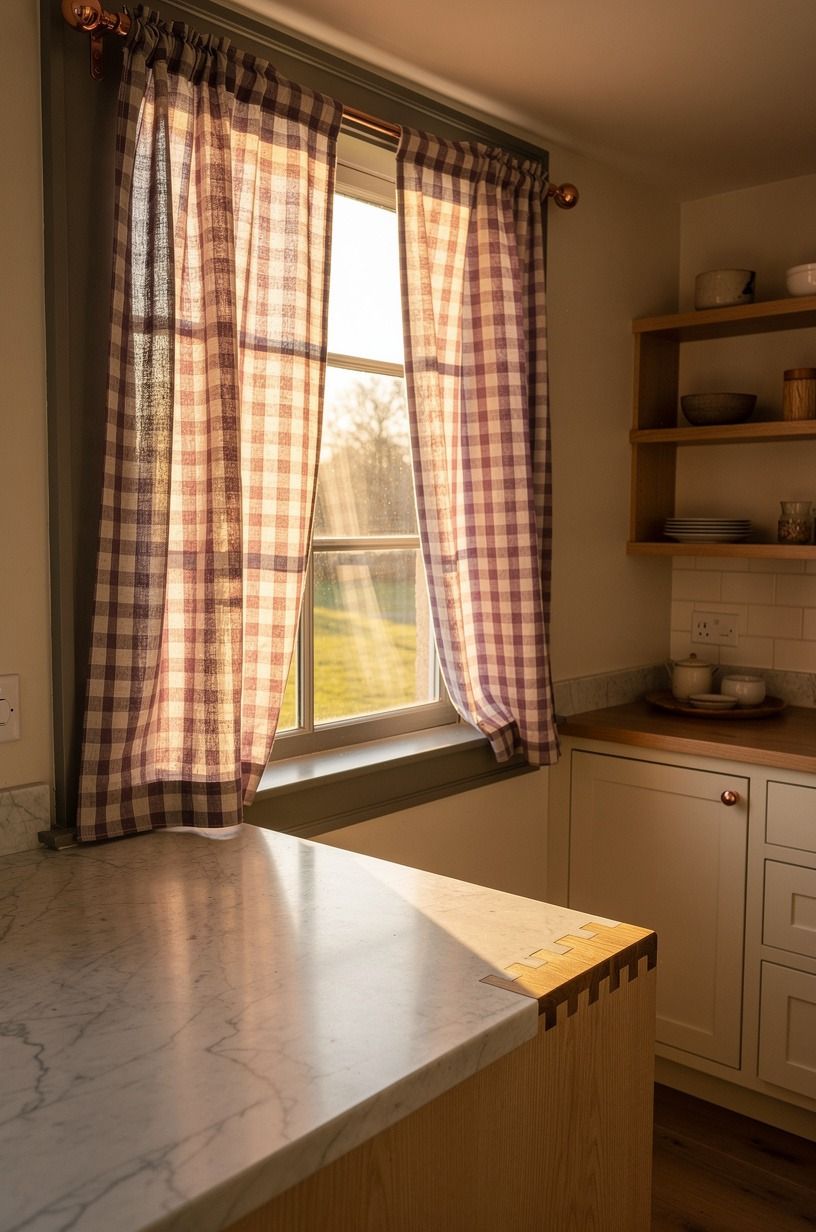
Frame the window halfway, not fully, if you want privacy without losing the light that makes a cottagecore kitchen breathe. Café curtains in washed Belgian flax linen soften the trim and make the whole breakfast end feel more inhabited. I'd skip anything too ruffled here.
A gentle gather is enough.
Mount the rod at the midpoint or a little lower so the upper glass stays open and bright. In a renter setup, a tension rod is usually all you need, and that no-drill part matters if you're testing the look first. The whole window takes on a honeyed, gathered feel when the linen is right.
But the fabric length matters just as much as the fabric itself. Let it land right at the sill or one inch below.
A brass cafe rod in unlacquered brass keeps the trim from reading too cutesy. For ideas on how window softness changes the whole light story, under cabinet lighting ideas to brighten your kitchen pairs well with this move.
14Display cutting boards beside a stoneware pitcher
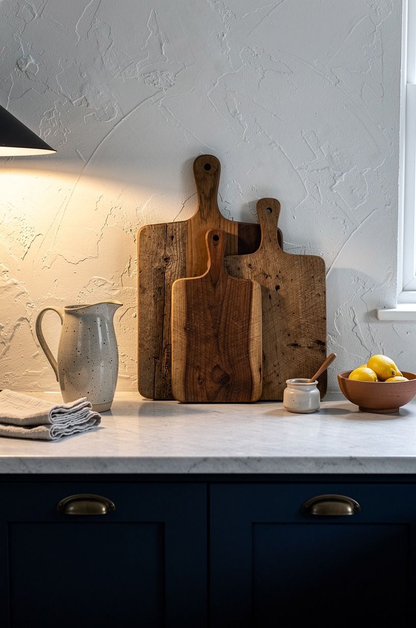
Display the working pieces you already own instead of buying more decorative filler. A group of wood cutting boards leaned beside a stoneware pitcher gives you height, grain, and a useful kind of stillness on the counter. I do this when a corner feels too blank but I still need it to function on a weekday morning.
Vary the board shapes so the stack looks easy rather than lined up. One paddle, one rectangle, one smaller round board, then the pitcher in front with a loose branch or two if you have them.
That quiet, grounded grouping is what gives the corner its warm, honest feeling. The wood wants weight, too, especially if your cabinets are navy or forest green. If you're comparing warm woods against painted cabinetry, white vs wood kitchen cabinets how to decide can keep the balance from turning muddy.
Simple, useful, and worth copying!
15A faded runner against glossy tile
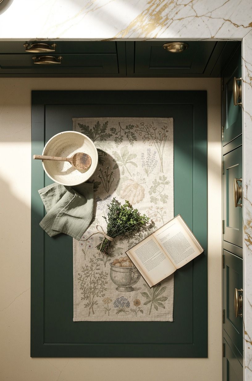
A faded botanical runner against glossy tile is the single move that grounds the whole room, because upper details only work when the base feels settled. When the floor is hard and reflective, every other layer feels like it's sliding; the runner pulls green cabinetry, cream walls, and worn wood into one warm sentence. I think this is the move people underestimate most.
Get the floor line right and the whole kitchen suddenly exhales.
Choose a runner that looks slightly quieter than you first think you want. Wool runner beats cotton here because it absorbs sound and softens each step.
The old-rug effect comes from muted color, not a loud vintage print screaming for attention. In a narrow galley, keep 42 to 48 in of walkway clearance around the busiest zone if you can, then size the rug so it frames the route instead of crowding it.
And if your kitchen opens to an outdoor cooking area, stone outdoor kitchen ideas for a timeless rugged look is oddly helpful for reading how stone, wood, and worn textiles sit together.
Why This Look Keeps Working Even in 2026
What people call cottagecore is really a reaction to kitchens that got too hard, too glossy, and too expensive to touch without a contractor. You don't need to rip out cabinets to fix that.
You need softness at hand level, age at eye level, and one material that grounds the room from below. That's why fabric under the sink works.
That's why an old-looking runner works. And that's why unlacquered brass feels better here than polished chrome ever will.
It earns its patina.
I learned this the annoying way. I used to start with the headline move, usually paint, because paint feels decisive.
But if the room still had bare windows, no texture, and nowhere for your eye to rest, the new color just sat there looking lonely against flat drywall and a bare laminate floor. Once I started layering in utility pieces you can see and touch every day, the kitchen stopped reading like a project and started reading like a life.
That's the difference. You want a room that looks as if breakfast happened there, bread cooled there, herbs got snipped there, and somebody opened the window while the kettle was going.
Here are the real renovation tiers, just so you don't overspend chasing a mood you can build in stages:
If I had a few hundred dollars, I'd spend it on fabric, paint, and hardware before I touched a countertop. Quartz can run $60-$120 per sq ft, laminate can sit closer to $10-$40 per sq ft, and repainted shaker fronts often cost $150-$400 per door.
Those numbers matter because they free you up. You can get the feeling first, then decide later whether the bones need more.
The Questions Worth Answering First
What is the best Cottagecore Kitchen Ideas for Whimsical, Storybook Charm for a small kitchen?
A sink skirt plus café curtains is the best pairing for a small kitchen because it adds softness without bulk. You keep the footprint open, hide visual mess, and warm the window line. If storage is tight, borrow scale cues from IKEA pieces and keep the patterns small.
Where can I buy Cottagecore Kitchen Ideas for Whimsical, Storybook Charm pieces on a budget?
Target, IKEA, and Wayfair are the easiest first stops for rods, curtains, knobs, and simple hutches. The real value is secondhand, though.
Facebook Marketplace, thrift stores, and antique malls are where transferware, copper, and old boards usually feel more convincing. For color direction, the most popular kitchen cabinet colors right now helps before you shop.
How much does a Cottagecore Kitchen Ideas for Whimsical, Storybook Charm makeover cost?
A cosmetic version usually costs about $100 to $300 if you're mostly adding fabric, thrifted pieces, and a rug, then climbs toward the low thousands if you paint cabinets and swap hardware. Free changes count too. Rehang plates, edit shelves, move your herbs, and restyle the counter first.
Can I create a Cottagecore Kitchen Ideas for Whimsical, Storybook Charm on a budget?
Yes, and you really can do a lot with cheap layered changes. Sink skirt on a tension rod.
Thrifted plates over the nook. Existing cutting boards grouped beside a pitcher.
None of that asks for demolition, and all of it makes the room feel more lived in fast.
Is a Cottagecore Kitchen Ideas for Whimsical, Storybook Charm worth it in a small space?
Yes, it's worth it because a small kitchen benefits from visual warmth with tight editing. You don't need many pieces for the look to read clearly.
One runner, one curtain move, one shelf treatment, then stop. Small rooms usually reward restraint more than big rooms do.
Is Cottagecore Kitchen Ideas for Whimsical, Storybook Charm a good idea for a rental?
Yes, it's one of the smartest rental styles because most of the best moves are reversible and low-risk. Tension rods, peel-and-stick details, removable hooks, and freestanding furniture do the heavy lifting. If you're nervous about committing to cabinet color, start with two tone kitchen cabinet ideas that add instant depth for safer contrast cues.
Where I'd Start First
If I had to pick one, I'd start with the faded botanical runner. Cabinets still look cold when the floor feels bare, and you can't layer warmth on top of a room that hasn't landed yet. Pin the wool runner idea for later and let it guide every other choice.